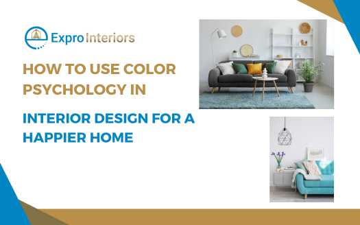
When you step into a room, the colors around you instantly shape how you feel. Some shades make you feel calm, others bring energy, and a few may even trigger memories.
This idea is what we call color psychology in interior design. It’s the study of how colors affect our mood and the way we experience a space. Designers use it to choose colors that not only look appealing but also set the right atmosphere.
The Science Behind Color Psychology in Interior Design
Colors have a strong impact on the human brain. Different shades can trigger different emotional and physical responses.
For example, warm tones like red and orange are known to raise energy levels, while cooler tones like blue and green often lower stress. This connection comes from both natural associations and cultural meanings.
Think about the ocean or a clear sky. They naturally feel calming, don’t they? That is why blue often creates a sense of peace indoors.
On the other hand, the warmth of fire or sunlight makes red and yellow feel lively and energizing. Eventually, these associations influence how we respond to colors inside our homes.
Color Psychology in Interior Design: Understanding its Significance
The way a room feels is just as important as how it looks. A well-designed space can uplift your mood, improve focus, or even help you relax after a long day. Color psychology in interior design plays a key role in achieving this balance.
For instance, a bright yellow kitchen can make mornings feel cheerful and motivating, while a soft green living room may help you unwind in the evening.
The right colors make a space feel natural for its purpose, whether it’s for work, rest, or social gatherings.
Color Psychology in Interior Design: How Different Colors Influence Interiors
As mentioned earlier, some shades calm the mind, others spark energy, and a few create a sense of luxury or warmth. Understanding these effects makes it easier to choose the right palette for each room in your home.
| Color | Psychological Effect | Best Used In | Design Tips |
| Blue | Promotes calmness, reduces stress, lowers heart rate, and supports concentration. Often linked with trust and stability. | Bedrooms for relaxation, bathrooms for spa-like feel, home offices for focus. | Light blues create airy and serene spaces. Navy or deep blue adds sophistication when paired with metallic or white accents. |
| Green | Associated with balance, growth, and renewal. Provides a sense of harmony and connection with nature. | Living rooms for a welcoming feel, kitchens for freshness, wellness areas for relaxation. | Combine with wood, rattan, or indoor plants for a natural vibe. Mint and sage tones are trendy for modern interiors. |
| Yellow | Boosts energy, sparks optimism, stimulates creativity. Can uplift mood but may feel overwhelming if overused. | Kitchens to start mornings cheerfully, dining rooms to encourage lively conversation, creative spaces like studios. | Works well as accent walls, upholstery, or décor. Tone it down with whites or soft grays. |
| Red | Stimulates excitement, increases appetite, enhances energy. Can also evoke passion and intensity. | Dining rooms to encourage appetite, entertainment areas for vibrancy, accent walls for bold statements. | Use sparingly on walls. Balance with neutrals or wood to avoid overstimulation. Great in textiles or art pieces. |
| Orange | Creates warmth, enthusiasm, and friendliness. Encourages activity and social interaction. | Living rooms for a lively mood, home gyms for energy, kids’ play areas for fun. | Pair with soft beige or gray to keep it modern. Terracotta tones give an earthy, cozy charm. |
| Purple | Evokes luxury, creativity, and spirituality. Historically linked to royalty. | Bedrooms for a romantic feel, meditation rooms for calmness, studios for creativity. | Lighter tones like lavender soothe, while darker purples feel dramatic and pair well with gold or silver accents. |
| Pink | Symbolizes warmth, nurturing, and playfulness. Brings softness to interiors. | Nurseries for comfort, bedrooms for coziness, lounges for a welcoming feel. | Dusty pinks or blush tones feel elegant and modern, while bright pinks can be used in small doses for fun accents. |
| White | Represents purity, simplicity, and spaciousness. Creates a sense of cleanliness and light. | Small apartments to make spaces appear bigger, minimalist homes, bathrooms for freshness. | Layer with textures (linen, wood, wool) to avoid a sterile look. Add colorful accessories to keep it lively. |
| Gray | Neutral and sophisticated, often linked to balance and maturity. Works well with most colors. | Offices for focus, living rooms for a sleek feel, bedrooms for subtle elegance. | Warm grays make spaces feel cozy. Cool grays pair beautifully with modern metal finishes. |
| Black | Conveys elegance, authority, and drama. Adds depth and definition to spaces. | Dining rooms for sophistication, kitchens for bold contrast, feature walls for drama. | Best used in accents like furniture, frames, or trim. Combine with white or metallics for a chic effect. |
| Brown | Creates warmth, stability, and comfort. Brings an earthy, grounded atmosphere. | Living rooms for coziness, libraries for depth, rustic or vintage-style interiors. | Works well with cream, green, or burnt orange. Leather furniture and wooden finishes highlight brown beautifully. |
Ways to Make Your Living Space Happier Through Color Psychology
Here are the many ways you can use color psychology in interior design to create a home that feels happier, more balanced, and perfectly aligned with your lifestyle.
1. Choose Warm Colors to Boost Energy
Warm colors like red, orange, and yellow are known for their energizing effects. They can make a space feel lively and inviting. It’s perfect for areas where you want motivation and interaction, such as the kitchen, living room, or home office.
Even small accents like cushions, rugs, or artwork in these colors can lift the overall energy of the space.
- Red sparks passion and excitement, ideal for dining areas where lively conversation is encouraged.
- Orange promotes creativity and sociability, making it great for creative corners or play areas.
- Yellow evokes happiness and optimism, perfect for entryways or sunlit rooms.
Using warm tones thoughtfully ensures your home feels vibrant without being overwhelming. Balance is key when it comes to leveraging color psychology in interior design. So pair these shades with neutral tones to create a harmonious environment.
2. Cool Colors for Calm and Relaxation
Cool colors, such as blue, green, and soft purples, naturally induce a sense of calm.
These shades are ideal for spaces where relaxation is the focus, such as bedrooms, bathrooms, or reading nooks. Cool colors reduce stress and create a serene atmosphere, which can improve mood and even support better sleep.
You can mix different shades of blue or green to add depth without losing the calming effect. For example, a soft pastel wall paired with a deeper-colored accent chair creates balance.
Green also connects you to nature, which subconsciously enhances well-being. Blue hues, especially near windows or natural light, feel expansive and refreshing.
3. Use Accent Walls for Emotional Impact
Accent walls are a creative way to introduce color psychology without overwhelming a room. When you paint one wall in a bold or contrasting color, you can draw attention and evoke specific emotions while keeping the rest of the space neutral.
- Living Room: A burnt orange or warm red accent can energize conversation areas.
- Bedroom: A calming teal or soft lavender accent behind the bed promotes relaxation.
- Office: A vibrant green accent stimulates focus and creativity.
You can experiment with trends or seasonal colors while maintaining the room’s overall harmony. Accent walls can also be enhanced with artwork or textured materials for a richer emotional effect.
4. Balance Neutrals with Color Pops
Neutrals like white, beige, and gray form the backbone of a happy home. They provide a calm yet versatile base that makes brighter colors pop and prevents spaces from feeling chaotic. You can strategically influence mood in different rooms by combining neutrals with accent colors with the help of color psychology in interior design.
- Beige or taupe walls provide a warm, cozy backdrop for furniture and art.
- Gray tones offer a sleek, modern feel that complements both warm and cool accents.
- White spaces enhance natural light and make colors appear more vivid.
Balancing neutrals with strategic pops of color ensures the home feels lively yet peaceful. You can swap out accent pieces over time to refresh the mood without major renovations.
5. Consider the Psychology of Room Function
The purpose of a room should guide your color choices. Certain shades naturally suit specific activities or moods, so using color with intention can make everyday life more joyful.
- Kitchen: Yellows and oranges stimulate appetite and conversation.
- Bedroom: Soft blues and greens encourage relaxation and restful sleep.
- Home Office: Greens and blues enhance focus, while small warm accents keep energy levels up.
While matching color to function as per color psychology in interior design, you can create spaces that intuitively support your lifestyle. It ensures every room contributes to overall happiness, rather than just looking beautiful.
6. Incorporate Natural Hues for Emotional Harmony
Natural colors inspired by earth, plants, and sky like browns, soft greens, and sky blues help create a grounding effect in your home. These tones reduce stress and connect you to nature, even if you are in a city apartment.
- Wooden furniture or bamboo flooring brings warmth and calm.
- Plant-filled corners enhance both color and mental well-being.
- Sky-inspired blues in walls or decor evoke openness and freedom.
Using natural hues as a base or in combination with brighter accents ensures a balanced, uplifting environment. These colors can help maintain a steady, happy mood at home.
7. Layer Colors to Add Depth and Dimension
Layering different shades of the same color or complementary colors can make a room feel more dynamic and visually interesting.
For example, using light blue on walls, medium blue on furniture, and dark blue in decor pieces creates a sense of depth that draws the eye and makes spaces feel larger.
This technique also allows you to subtly influence emotions. Lighter tones can make a room feel airy and peaceful, while darker shades create a cozy and intimate atmosphere. Layering ensures your home feels thoughtfully designed rather than flat or monotonous.
In practice, you can combine textures with layered colors. For instance, a soft green velvet sofa paired with pale green walls and forest green cushions adds richness while maintaining calm energy. This makes each room feel curated and emotionally balanced.
8. Use Color to Define Zones
Color can act as a natural way to define functional zones within a single space, particularly when you make the right use of color psychology in interior design.
In open-plan layouts, different colors can help separate living, dining, and workspace areas without walls. A soft beige living area paired with a pale green dining space clearly delineates each zone while maintaining harmony.
This method works especially well in studio apartments or multifunctional rooms. Choosing colors that complement each other ensures the flow of the room feels natural. You can also use rugs, furniture, or accent walls in these colors to reinforce the separation.
Defining zones through color not only organizes your space but also subtly cues your mind into the purpose of each area. The living room feels for relaxation, the dining area for socialization, and the workspace for focus, improving overall home happiness.
9. Highlight Architectural Features
Colors can emphasize architectural elements like alcoves, ceilings, moldings, or staircases, turning ordinary features into points of interest. Painting a ceiling a soft sky blue, for example, creates an illusion of height and openness.
Accentuating moldings or trim with contrasting colors adds elegance and sophistication while drawing attention to design details. This technique encourages visual exploration of your home, making it more engaging and pleasant to live in.
Highlighting architecture with color also allows for creativity without overwhelming the room. Strategic use of bold or subtle tones can create focal points. It can guide the eye naturally and enhancing overall satisfaction with your living space.
10. Incorporate Seasonal Colors
Colors inspired by the seasons can influence mood according to natural cycles. Warm oranges, reds, and browns in autumn create coziness, while pastels in spring evoke freshness and renewal.
Summer-inspired shades like bright blues and yellows bring energy and cheer, and winter’s deep blues or muted grays encourage calm.
Rotating accent pieces or decor elements according to seasons keeps your home feeling lively and in tune with nature. This also reduces monotony and enhances emotional well-being by subtly aligning your environment with natural rhythms.
Seasonal color changes don’t require a full renovation. Swapping cushions, curtains, rugs, or wall art is enough to refresh the home and make it feel aligned with the season, thus contributing to a happier, more dynamic atmosphere!
11. Apply Monochromatic Schemes for Simplicity
Using a single color in varying shades throughout a room can create a cohesive, harmonious look that feels soothing and uncluttered.
Monochromatic schemes reduce visual chaos and make spaces feel intentional.
For example, a living room in shades of taupe, beige, and cream creates a calm and elegant environment. You can add subtle texture through fabrics, rugs, or curtains to prevent the space from feeling flat.
This works well in minimalist or modern interiors, where simplicity promotes mental clarity. The lack of contrasting colors helps reduce stress, making monochromatic schemes a powerful tool for emotional balance at home.
12. Use Color to Stimulate Creativity
Certain colors can inspire creativity, making them ideal for workspaces, art corners, or play areas. Bright and bold tones like oranges, reds, and yellows encourage innovative thinking, while greens and blues promote focus and mental clarity. Incorporate these colors in walls, furniture, or accessories where creative activities happen.
For instance, an orange desk chair in a blue-walled office can subtly boost energy without overwhelming the senses.
Using color intentionally to stimulate creativity helps turn everyday tasks into more engaging experiences. It creates a home environment that supports your passions, hobbies, and productivity.
13. Promote Social Interaction Through Color
Colors like warm reds, yellows, and oranges naturally encourage conversation and interaction, making them perfect for spaces where family and friends gather.
Dining rooms, living rooms, or lounges can benefit from these vibrant shades.
Pairing warm tones with comfortable seating and soft lighting enhances a welcoming atmosphere. You can also use patterned rugs, colorful artwork, or cushions to reinforce sociability without painting entire walls bold colors.
Intentional use of colors for social interaction strengthens family bonds and creates a cheerful, energetic home environment. Even subtle accents can make a difference in mood and engagement during gatherings.
14. Soften Bold Colors with Neutrals
Using bold colors can create energy, but too much can overwhelm. Balancing them with neutrals like white, beige, or gray ensures a harmonious and uplifting environment.
For example, a bright red wall paired with cream furniture and soft beige rugs feels lively but controlled. This combination allows you to enjoy bold colors without stress or visual fatigue.
Softening bold colors with neutrals helps maintain emotional balance. It gives you freedom to experiment with vibrant tones while keeping your home serene and comfortable for daily living.
15. Opt for Pastel Colors to Reduce Anxiety
Pastel shades like soft pink, mint green, baby blue, and lavender have calming effects on the mind. They are excellent choices for bedrooms, nurseries, or meditation spaces where relaxation is a priority.
Pastels provide color without intensity, creating spaces that feel airy, gentle, and peaceful. Mixing pastels with white or light wood adds warmth and freshness.
Using these colors consistently in areas where stress reduction is desired encourages mental calmness. It can make your home a safe and restorative space where happiness is reinforced by the environment.
16. Create Contrast for Visual Interest
Contrasting colors can make spaces feel dynamic and exciting. For instance, pairing complementary colors like blue and orange or purple and yellow draws attention to furniture, decor, or walls.
This technique is ideal for accentuating specific areas or objects in a room. Contrasts create rhythm and movement visually, preventing a room from appearing flat or monotonous.
When used thoughtfully, contrast enhances mood by making the home feel stimulating without being chaotic. It encourages engagement with the space and can lift spirits by adding variety and personality.
17. Reflect Natural Light with Strategic Colors
Certain colors, especially light tones like white, cream, or pale yellow, can reflect natural light and make rooms appear brighter and more spacious. This has a direct impact on mood because brighter spaces are associated with positivity and energy.
Combining reflective colors with mirrors or glossy surfaces amplifies light, creating an open and airy feeling. Rooms with ample natural light and bright colors often feel happier and more inviting.
Consciously choosing colors that enhance natural light improves the atmosphere of your home. Brighter spaces encourage activity, reduce stress, and positively affect overall emotional well-being.
Golden Rules of Color Psychology in Interior Design
Simple principles that guide how colors influence mood, harmony, and happiness in your home.
- Match colors to the purpose of the room
- Balance warm and cool tones
- Use neutrals as a grounding base
- Layer shades for depth and dimension
- Keep bold colors as accents, not main tones
- Consider natural light before finalizing shades
- Maintain consistency across connected spaces
- Refresh accents seasonally for variety
- Choose colors that reflect your personality
- Always test colors in your actual space
Bring Joy to Every Corner with Expro Interiors
Our designers at Expro Interiors combine the art of color psychology in interior design with thoughtful interiors to create spaces that feel alive yet soothing.
We carefully select shades, textures, and accents that not only enhance the look of your home but also uplift your mood, spark energy, and promote relaxation. From cozy living rooms to calming bedrooms, every element is chosen with care so your home feels welcoming and full of warmth.
We understand that a home is where memories are made and emotions flourish.
That’s why we design spaces that encourage connection, creativity, and peace. Whether it’s a vibrant kitchen that brings the family together, a serene reading nook, or a playful corner for children, our style and thoughtfulness ensures that every room resonates with joy and comfort.
With us, your home becomes a sanctuary that reflects your personality while making every day feel brighter and more inspiring.